Keeping track of customer engagement, health, and ultimately renewal or churn rates is a must for anyone new to leadership in Customer Success. Unfortunately, new leaders often stumble in this area, being misled in their understanding of their users.
This often happens when they:
- don’t have robust data on user behavior
- put too much emphasis on account-level metrics (vanity metrics) that make us feel good
- lack hands-on experience with data analysis
In this article, I’m going to explain how to develop a better, usage data-driven understanding of your user base using cohort analysis. If you’re new to cohort analysis, don’t worry! This is a beginner’s guide so we’ll take it slow.
Before we dive into the step-by-step, it’s worth pausing to truly appreciate the deficiencies of the traditional account-level metrics (ALMs) approach to analyzing engagement.
1. These values are averaged over a population of users, which naturally smooth out and subsequently overlook fluctuations at the user level.
2. Similarly, ALMs treat each user as equal influencers of account health, when in actuality they aren’t. For example, it’s much more meaningful when a high-level manager completed an action in your product vs. an intern.3. Finally, most account-level usage indicators only measure outcomes-based indicators, overlooking the step-by-step usage patterns of how a user drives those outcomes; if user A gets to the same valuable outcome using your tool in half the time as user B, there’s a stronger likelihood they’ll be strong champions. With that perspective in mind, let’s outline how to get to our ultimate goal.
The crux of the process is letting the power users of your tool speak for themselves, as opposed to prescriptively identifying indicators of what you perceive of strong expertise and measuring against those (i.e. don’t measure based on your mental model of product expertise; let your users define it for you).
It also relies instrumentally on your organization having robust usage data at the user level, which admittedly is non-trivial to implement. However, whether it be by way of instrumenting your product with tracing or observability tools, or implementing a RUM-based approach, this is an investment crucial to the success of your business.
Step 1: Identify your Baseline
With their understanding of their user base, have your CSMs identify pools of both strong users (“experts”) and intermediate users, based purely on their experience working hand-in-hand with them (i.e. without consulting traditional usage data).
Step 2: Explore your data
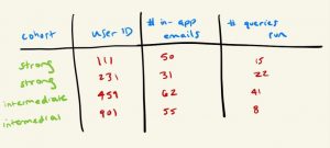
Depending on the team member, there’s always room for misinterpretation, especially for a data project this early on. Do some basic analysis of the users identified using metrics like logins, or assets built; the metrics of choice depend on your company’s tool, so leverage your knowledge of how users get value from your product, and confirm that these cohorts are indeed robust.
Step 3: Determine what measures could potentially indicate expertise (how could these power users’ strength appear in data?)
Now that you’ve confirmed these users are healthy, think about other ways (aside from the initial measures from step 2) one could potentially measure expertise in your tool. Is logins enough, or should you consider such measures as number of times per day they customize a component, generate an in-tool email, share an asset amongst team members, etc? The product of this exercise is often called your “dimensional space” (because you’re creating dimensions against which you measure health and expertise), and the more measures you can add to the dimensional space, the more robust, flexible, and ultimately accurate your model will be.

Step 4: Perform some averages of these measures within the cohorts (which metrics are those most different between the two groups?)
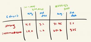
Once you have your dimensional space (i.e. all the potential measures of expertise you want to investigate), it’s time for some statistics (don’t worry, nothing too daunting!). Keep in mind that this step (and the one following) are there for pruning purposes – your goal is to determine if your measures in your dimensional space are noticeably different between your two cohorts of users, since the ones that are typically should hold higher influence in the final product. Take your two cohorts, and average the values for each measure amongst its cohort (e.g. average number of assets created for Expert cohort, and average for Intermediate cohort).
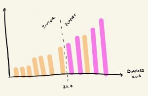
Step 5: For the most impactful measures from step 4, plot the distribution of values to find a reasonable boundary line between the two cohorts
This step allows us to determine where we draw the line for each of our measures between our two cohorts. You’ll find that, more than likely, there won’t be a clean separation – i.e. plotting them in increasing order, all intermediates won’t fall on one side of an imaginary line from the experts. But use your best judgment as to where the majority of the experts separate from others. Take note of where these lines are, as we’ll be using them in a couple steps in our final model!

Step 6: Rank the levelof impact of the measures
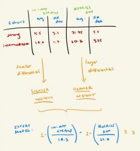
Those with a smaller differential between cohorts should be lower, while those with larger differentials should be higher. For those that end up higher, give them a higher weight.
At this point, you should have a table of some form, where your two cohorts (Intermediate and Expert) have average and standard deviation values for each of your measures (in this context, think of measures as spreadsheet columns, and the cohorts as rows). Look at the average value pairs for each measure (e.g. the average logins for Intermediates, compared to average logins for Experts) and see which measures have a substantial difference. If you have a fair number of measures in your dimensional space, it may make sense to tier them – measures with a large differential should be in tier 1, medium level in tier 2, and so on.
Once you’ve ranked/tiered your measures, it’s time to wrap this up! How to do that is “weight” your model, which just means make the measures with a higher differential have a higher level of influence on the outcome, in this case by way of a multiplier.
Step 7: With your completed model, run it across your entire user base to tag each use as “Strong” or “Intermediate”
Now that you have your final product – your shiny new model for what defines an expert user – apply it to all users (as opposed to just the subset of users your CSMs generated for you way back in step 1). The outcome should be a tag you apply to your users of “Expert” or “Intermediate” (extra credit if you want to extend this further by tagging “Beginner” as those that are even lower in total, based on the model).
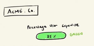
Step 8: With your users all tagged, perform a rollup by account to determine what percentage of users at each customer are labeled as “Expert” and “Intermediate”, for use in account-level health scoring
And finally, now that you have your list of users and their tags, you can do a simple rollup to count the number of experts and intermediates per account. To make this truly useful for account-level health scoring, do a calculation of “percentage of users at each account that are expert”
(# of Experts/Total # of Users) * 100
One final note: this beautiful statistical machine you’ve built is not a one-time-run, build-it-and-chuck-it kind of tool; you can have it run daily, as you want it to catch new experts over time!
With the final product in hand, you can better identify ebbs and flows in usage and adoption by your user base, as this model you’ve deployed can be run continuously (as users can straddle cohorts), thus allowing better prediction of expansion and churn than the account-level health measures to which we’ve grown accustomed.
Author: Josh Levin